Chapter 01
Introduction
Welcome
This guide defines how Weego expresses itself, visually and verbally, across its products, materials and interactions. It is the single reference for anyone who designs, writes or produces anything on behalf of Weego.
Who this guide is for
This guide is intended for internal Weego teams (product, design, marketing, communications, HR, sales) as well as external partners (agencies, freelancers, contractors) who produce content under the Weego brand.
How to use it
Each chapter sets clear rules, illustrated with examples and counter-examples. When in doubt, the rule takes precedence over the individual case. If doubt persists, the brand team decides.
Chapter 02
Brand Foundation
Who we are, mission, vision, values, positioning
Who we are
Weego is the mobility system that connects passengers, companies and operators. Born in Africa, designed for the world.
Our mission
Make mobility simple, reliable and accessible — for every passenger, every company, every operator.
Our vision
Cities in motion, connected, easy to access.
Our values
Useful first.
Every decision is measured by its real impact on the user. No features for features' sake, no design for design's sake.
Feet on the ground.
We listen to the field before we listen to trends. Where we operate, we test, we adjust, we stay close to real usage.
Simple by discipline.
Simplicity is work, not a shortcut. We remove before we add.
Reliability as a creed.
Reliability isn't a goal — it's our way of being. Every trip, every interface, every interaction is a promise kept.
Positioning Statement
Weego is the mobility system that makes movement simple, reliable and accessible — for passengers, companies and operators. Born in Africa, designed for the world, obsessed with useful.
Chapter 03
Brand Architecture
Masterbrand + 3 sub-brands
Founding principle
One Weego. Three faces.
Weego is a single brand, declined into three sub-identities that share the same visual and editorial DNA. Each sub-identity speaks to its audience without ever breaking the masterbrand's coherence.
Golden rule
Purple + Yellow, everywhere. Always.
Purple Heart and Mikado Yellow are Weego's indelible signature. They appear in the visual reality of every product (materials, templates, UI, comms), even when they're not in the logo. The product accent (Torch Red for Weego, Mikado Yellow for Weegolines, Indigo Tech for WeegoPro) comes in addition — never as a replacement.
Weego
B2C passengers
Accent : Torch Red
Tone : Warm, complicit
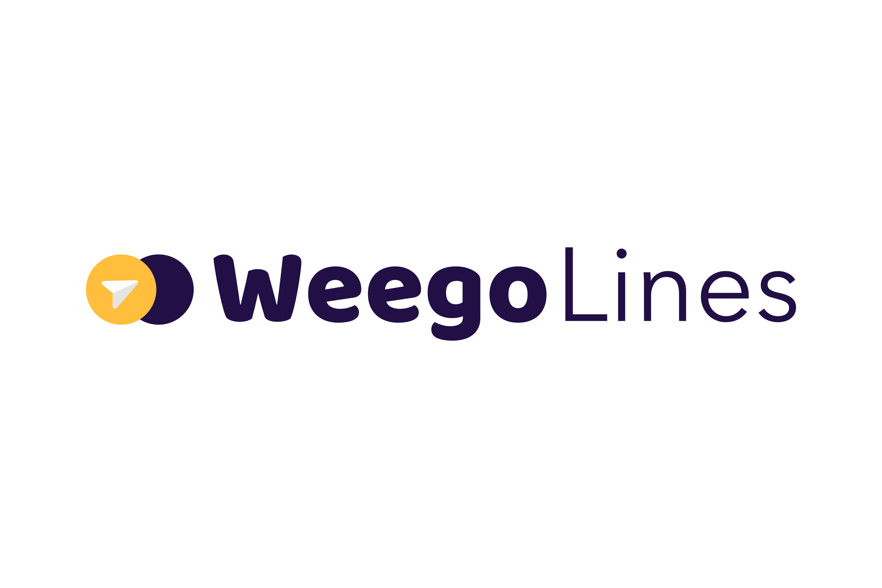
Weegolines
B2B companies
Accent : Mikado Yellow
Tone : Reassuring, pro
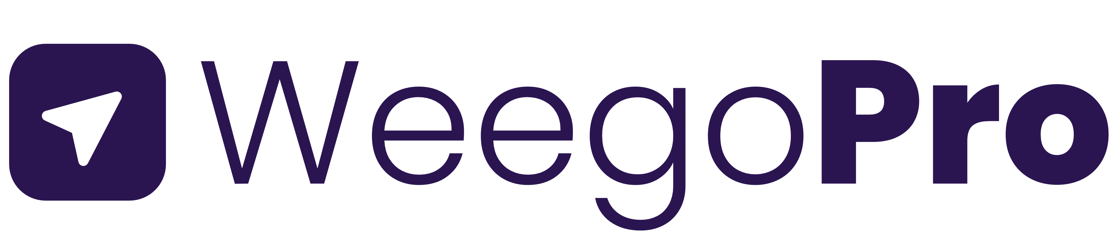
WeegoPro
B2B operators
Accent : Indigo Tech
Tone : Expert, precise
Coexistence rules
Do
- Always include Purple + Yellow on every material, even Weegolines or WeegoPro.
- One product accent per material (Red OR Yellow OR Indigo).
- Keep the logo family, typographic system and shared visual DNA.
- Each sub-brand uses its own logo on its dedicated materials.
Don't
- No Weegolines or WeegoPro material without both Purple AND Yellow visible.
- Never mix two product accents in the same piece.
- Never use the product accent in place of Purple or Yellow.
- No B2B jargon on Weego, no casual tone on WeegoPro.
Color proportions per sub-brand
| Purple Heart | Mikado Yellow | Shadow Planet | White | Accent | |
|---|---|---|---|---|---|
| Weego | 30-40% | 15-25% | 10-15% | 20-30% | 10-15% Red |
| Weegolines | 25-35% | 20-30% | 15-25% | 25-35% | Yellow amplified |
| WeegoPro | 15-25% | 5-15% | 20-30% | 35-45% | 10-15% Indigo |
The more expert the B2B use case (WeegoPro), the more neutrals and whites dominate. Purple and Yellow remain present throughout.
Corporate Weego (the group)
When speaking of the group (corporate site, investor deck, executive business card, institutional communication), we use the Weego masterbrand with:
- Weego logo
- Core colors only (Purple + Yellow + Shadow Planet + White)
- No product accent
- The three sub-brands may be mentioned as a portfolio, each with its visual accent inside a dedicated frame.
When to choose which sub-brand
- I'm speaking to an individual who wants to get around: Weego
- I'm speaking to a company that wants to organise employee transport: Weegolines
- I'm speaking to an operator or carrier who wants to run their business: WeegoPro
- I'm speaking about the group as a whole: Weego masterbrand
Chapter 04
Voice & Tone
Principles, rules, vocabulary, examples by channel
The global Weego voice
Four principles frame every Weego utterance, whatever the product or channel.
Useful.
Every sentence must be of service. No filler.
Clear.
Zero gratuitous jargon. If a simple word works, we use the simple word.
Human.
We speak to a person, not a marketing target.
Steady.
Confidence without arrogance. We don't need to shout.
Hard writing rules
Valid across all three sub-brands, without exception.
- Never an em dash. We use periods, commas, colons or parentheses.
- No hollow jargon. No "innovative solution", "unique experience", "revolutionise", "disrupt".
- No empty superlatives. No "amazing", "fantastic", "magical".
- Always active rather than passive. "We notify you" instead of "You will be notified".
- Short sentences by default. One idea, one sentence.
- Numbers as digits from 10 on.
- No emoji in official communication. OK only on Weego social (B2C), never on Weegolines or WeegoPro.
- No exclamation marks, except Weego B2C and sparingly.
Tone matrix by sub-brand
| Weego | Weegolines | WeegoPro | |
|---|---|---|---|
| Who's listening | Daily passenger, student, urban professional | HR, Office Manager, Facilities | Ops Director, fleet manager, transport founder |
| What they want to hear | This makes my life easier | My employees are well taken care of, I manage it simply | I run my business stress-free, I gain efficiency |
| Register | Informal | Formal | Formal |
| Tone | Warm, complicit, direct | Reassuring, pro, clear | Expert, precise, confident |
| Dominant emotion | Energy, closeness | Trust, calm | Mastery, credibility |
| Sentence | Short, punchy | Medium, steady | Medium to precise |
| Emoji | Yes, targeted | No | No |
| Exclamation | Rare | No | No |
Examples by channel
Push notification
Weego
“Your bus is 2 min away. Head to the stop.”
Weegolines
“Your shuttle arrives at 8:12 am. Departing from Hay Riad stop.”
WeegoPro
“Fleet alert. Vehicle WG-204 reports a 12 min delay on line B.”
Email subject
Weego
“Tomorrow's trip, already set.”
Weegolines
“Your shuttle schedule for the week.”
WeegoPro
“Weekly report, April 22.”
LinkedIn post
Weego
“Two cities, three modes, one app. Weego takes you where you need to go.”
Weegolines
“Your teams deserve better than commute stress. We handle it.”
WeegoPro
“Fewer spreadsheets. More visibility. WeegoPro simplifies your fleet management.”
Landing hero
Weego
“Move smart. Move Weego.”
Weegolines
“The home-to-work shuttle, stress-free.”
WeegoPro
“Run your fleet. Really.”
Anti-examples
Don't
“Weegolines revolutionises corporate mobility with an innovative integrated solution.”
Do
“Weegolines organises the home-to-work trips of your teams. Simply.”
Don't
“With WeegoPro, your fleet management experience will be magical and effortless.”
Do
“WeegoPro gives you the visibility and control your operation was missing.”
Don't
“Weego, the amazing app that changes EVERYTHING !!!”
Do
“Weego. Your transport, at a glance.”
Vocabulary
We say instead of:
- "Mobility system" instead of "mobility solution"
- "Passenger" instead of "user" (in external communication)
- "Operator" instead of "carrier" (WeegoPro context)
- "Trip" instead of "ride" (except taxi context)
- "Platform" instead of "app" (when speaking of the global ecosystem)
- "Reliable" instead of "robust" or "performant"
Chapter 05
Logo System
Logo family, clear space, usages, forbidden uses
The Weego family
One Weego.
Three faces.
The brand declines into three product expressions, each with its own audience and chromatic accent, sharing the same typography and visual DNA. The Weego masterbrand remains the group's identity, reserved for corporate and institutional communication.
Weego
B2C · passengers
Warm, complicit, direct
Weegolines
B2B · companies
Reassuring, pro, clear
WeegoPro
B2B · operators
Expert, precise, confident

Masterbrand · 00
Weego. The group's identity.
Reserved for corporate, investor and institutional communication. Core colors only: Purple Heart, Mikado Yellow, Shadow Planet, White. No product accent.


Sizes
24px48px96pxWeego family logos
- Weego logo. Two joined circles, an arrow inside the first circle, wordmark in Baloo Bold.
- Weegolines logo. Extension of the Weego logo with the word "Lines" integrated into the design.
- WeegoPro logo. Extension of the Weego logo with the word "Pro" integrated into the design.
Usage rules
- Minimum clear space: equivalent to the diameter of one logo circle around the entire logo.
- Minimum size: 24px digital, 15mm print, to remain legible.
- Color versions: full color (purple + yellow) and monochrome (Shadow Planet or White depending on background).
Logos on backgrounds
Full-color logos can be used on most backgrounds, except those that create a chromatic conflict (white and purple without sufficient contrast). On photos, use the full-color version on photos within the Weego palette, and the monochrome version on black-and-white photos.
Forbidden uses
Don't
- Don't crop the logo.
- Don't change the transparency.
- Don't swap the colors.
- Don't use colors outside the palette.
- Don't change the size or position of the wordmark and circles relative to each other.
Don't
- Don't distort the logo.
- Don't add shadows, gradients or other effects.
- Don't recreate the logo with a different font.
- Don't outline the wordmark.
- Don't rotate part of the logo.
Partner lockups
The partner lockup is used for approved partnership communications. Rules:
- Weego logo placed to the left of or above the partner logo.
- Clear space between both logos equal to the size of the Weego logo circles.
- Vertical separator line centered in that space.
- Both logos must appear of equivalent size.
- The partner logo aligns to the optical baseline of the Weego wordmark.
Rules for partners
- Don't use the Weego name or mark in the name of another entity.
- Don't use the Weego name or logos in advertising without our explicit approval.
- Don't use Weego assets or similar words on clothing or merchandising.
Logo assets. See chapter 13.
Logo files (SVG, PNG, EPS) for the 3 sub-brands + masterbrand, available via the Weego DAM.
Chapter 06
Color System
Core, accents, neutrals, tints, accessibility
Core colors
Always present, on every material.
| Name | HEX | RGB | CMYK | Pantone |
|---|---|---|---|---|
| Purple Heart | #673AB7 | 103, 58, 183 | 44, 68, 0, 28 | 2096 C |
| Mikado Yellow | #FFC611 | 255, 198, 17 | 0, 22, 93, 0 | 7549 C |
| Shadow Planet | #220F46 | 34, 15, 70 | 51, 79, 0, 73 | 2765 C |
| White | #FFFFFF | 255, 255, 255 | 0, 0, 0, 0 | N/A |
Product accents
One color per sub-brand, in addition to the core colors — never as a replacement.
| Name | Product | HEX | RGB | CMYK |
|---|---|---|---|---|
| Torch Red | Weego | #FC0B42 | 252, 11, 66 | 0, 96, 74, 1 |
| Mikado Yellow | Weegolines | #FFC611 | 255, 198, 17 | 0, 22, 93, 0 |
| Indigo Tech | WeegoPro | #2E3B8C | 46, 59, 140 | 91, 77, 0, 0 |
Neutrals
Essential for UI, long-form text and scale-up polish.
Tints and shades
Each core color is declined on five steps to give flexibility to hover states, backgrounds, data-viz.
Purple Heart
100
#EDE3FA
300
#B79CE3
500 · base
#673AB7
700
#4A228C
900
#2E1360
Mikado Yellow
100
#FFF6D6
300
#FFDE7A
500 · base
#FFC611
700
#C99500
900
#805E00
Same to be generated for Torch Red and Indigo Tech based on design system needs.
Deprecated colors
Not removed, not forgotten — but not in the active palette. Usage: seasonal packaging, ephemeral campaigns, specific illustrations. Never as a signature color.
French Rose
#FC4885
Carrot Orange
#FC8D16
Cold Purple
#B39FDB
Gradients
Gradients are allowed when needed, notably for hero sections, CTAs and editorial backgrounds. They must stay within the core palette (Purple Heart → Shadow Planet, Purple → Mikado Yellow as a luminous transition, product accents for sub-brand surfaces).
Principle: the gradient serves emotion or hierarchy, not decoration. When in doubt, solid color remains the default.
Accessibility (WCAG AA validated pairs)
Readable text on background:
- On Purple Heart: White OK, Mikado Yellow OK, Shadow Planet no.
- On Mikado Yellow: Shadow Planet OK, Ink OK, White no, Purple Heart no.
- On Shadow Planet: White OK, Mikado Yellow OK, Cloud OK.
- On White: Shadow Planet OK, Purple Heart OK, Ink OK, Mikado Yellow no.
- On Torch Red: White OK, Shadow Planet no.
- On Caribbean Green (system usage: success): Shadow Planet OK, White no.
- On Indigo Tech: White OK, Mikado Yellow OK.
Simple rule. Shadow Planet or White for 95% of cases. Mikado Yellow must never carry white.
Chapter 07
Typography
Stack, scale, Arabic, application per product
The typographic stack
| Role | Font | Scripts |
|---|---|---|
| Display · titles, hero, posters | Poppins | Latin |
| UI / App · native interfaces | Outfit | Latin |
| Body · paragraphs, web | Inter | Extended Latin |
| Editorial emphasis · italics | Georgia | Latin |
| Arabic · all uses | Readex Pro | Arabic + Latin |
| Mono · WeegoPro only | JetBrains Mono | Latin |
Removed: Amiko (no consistent Arabic support), Space Grotesk (aligned with the Poppins/Inter site stack).
Live specimens
Poppins
Display · titles, hero, posters
Latin
Bouge malin. Bouge Weego.
Outfit
UI / App · native interfaces
Latin
Clean UI. Fast interactions.
Inter
Body · paragraphs, web
Extended Latin
Plan, book and pay for all your urban transport in one app.
Georgia
Editorial emphasis · italics
Latin
brand system.
Readex Pro
Arabic · all uses
Arabic + Latin
التنقل الحضري في أفريقيا
JetBrains Mono
Mono · WeegoPro only
Latin
const weego = {move: true};
Typographic scale
Based on a 1.25 modular ratio (major third), valid across all three sub-brands.
| Role | Font | Weight | Web (size / line-height) | |
|---|---|---|---|---|
| Display XL | Poppins | Extrabold 800 | 64 / 72 | 72pt |
| Display L | Poppins | Extrabold 800 | 48 / 56 | 52pt |
| H1 | Poppins | Bold 700 | 36 / 44 | 36pt |
| H2 | Poppins | Bold 700 | 28 / 36 | 28pt |
| H3 | Poppins | Semibold 600 | 22 / 28 | 22pt |
| H4 / Eyebrow | Inter | Semibold 600 | 14 / 20 · +12% | 12pt |
| Body Large | Inter | Regular 400 | 18 / 28 | 14pt |
| Body | Inter | Regular 400 | 16 / 24 | 11pt |
| Body Small | Inter | Regular 400 | 14 / 20 | 10pt |
| Caption | Inter | Medium 500 | 12 / 16 | 9pt |
| Emphase italique | Georgia | Italic 400 | variable | variable |
| Mono (WeegoPro) | JetBrains Mono | Regular 400 | 14 / 20 | 10pt |
Application rules
- Letter-spacing. Poppins at large sizes (>48px): tracking -2% to -2.5%. Inter in body: tracking at 0.
- Case. Never all caps, except Eyebrow (H4) and UI tags.
- Alignment. Left by default. Centered only for hero sections and poster titles.
- Justified. Forbidden. Too many rivers, broken reading.
- Editorial italic. Georgia italic is the Weego signature for editorial emphasis (like "brand system."). To be used in hero, never in running body.
Application by sub-brand
| Weego | Weegolines | WeegoPro | |
|---|---|---|---|
| Display headlines | Poppins Extrabold, tight tracking | Poppins Bold, normal tracking | Poppins Semibold, normal tracking |
| Typographic energy | Strong contrast, large sizes | Steady, medium contrast | Sober, clear hierarchy |
| Editorial emphasis | Occasional Georgia italic | Discreet Georgia italic | No editorial italic |
| Mono | No | No | Yes, for KPIs, codes, data-viz labels |
| Italic | Rare (emphasis) | Rare (emphasis) | Yes, for variables and parameters |
Arabic typography
- Readex Pro is the official Arabic font. It can be used alone or paired with Poppins and Inter.
- RTL reading direction is respected everywhere (posters, app in Arabic mode, bilingual documents).
- Never Arabic in Poppins or Inter. These fonts don't support it correctly.
- Arabic line-height: +10% compared to Latin.
- Sizes: use the same modular scale. The Arabic eye reads larger, so you can drop one step if density is too high.
- No uppercase in Arabic (doesn't exist). Adapt titles on bilingual materials.
Bilingual case
Common in Morocco, Senegal and other markets. Rules:
- Latin on top, Arabic below, or left / right depending on the material.
- Same visual hierarchy, equivalent weight.
- Two Weego logo versions if needed (Latin + Arabic), to be created if missing.
Do
- Respect the hierarchy (Display, H1 to H4, body, caption).
- Poppins for titles, Inter for body.
- Georgia italic for rare editorial emphasis.
- Readex Pro mandatory for all Arabic content.
- JetBrains Mono only in WeegoPro context.
Don't
- Mix more than two Latin fonts on a single piece.
- Use Poppins for long body (reserved for display).
- Put Arabic in Inter or Poppins.
- Use Space Grotesk or Amiko (removed from stack).
- Introduce improvised fonts outside the stack.
Chapter 08
Iconography
Style, grid, transport signature, semantics
Principles
- Style. Line, 1.5 to 2px stroke, rounded caps, rounded angles (2px radius).
- Base grid. 24×24px, 2px internal padding (shape fits within 20×20).
- Render. Monochrome by default. Color accent reserved for active states or rare highlights.
- Legibility. If the icon isn't legible at 16px, we simplify it.
- Personality. Neutral but warm. Not cute, not cold.
System · 24×24
Phosphor Regular / Hugeicons
Official sizes
| Size | Usage |
|---|---|
| 16px | Inline in text, tags, badges |
| 20px | Secondary buttons, form fields |
| 24px | Default size (navigation, lists, CTAs) |
| 32px | Features, empty states |
| 48px and above | Hero, illustrations, onboarding |
Sizes in use
Visual states
| State | Treatment |
|---|---|
| Default | Shadow Planet stroke (light bg) or White (dark bg) |
| Hover | Purple Heart stroke |
| Active / Selected | Filled Purple Heart OR product-accent stroke |
| Disabled | Fog stroke #D9D9DE |
| Warning | Torch Red stroke |
| Success | Caribbean Green stroke |
Visual states · live
Default
Shadow Planet
Hover
Purple Heart
Active
Filled
Disabled
Fog
Warning
Torch Red
Success
Caribbean Green
Torch Red is both a product accent (Weego) and the system warning color. Caribbean Green is no longer a product accent but remains the system success color. No conflict: the usage contexts don't overlap.
Base library
Starting point: Phosphor Icons (phosphoricons.com) in Regular variant by default, with Bold as a fallback for small sizes.
Transport icons (custom signature to produce)
Priority 1 (13 icons to draw): bus, tram, metro, train, taxi, car, motorbike, moto-taxi, bike, scooter, pedestrian, shuttle, minibus.
13 transport icons to draw. Grid 24×24, 2px stroke, side view, facing left.
Priority 2 (4 icons to add next): ferry, plane, cable car, tricycle (keke / tuktuk).
Transport icon drawing rules
- Side view, simplified.
- Constant 2px stroke.
- Stylised wheels (simple circle, no details).
- Default direction: facing left. Mirror in RTL Arabic context.
Application by sub-brand
| Weego | Weegolines | WeegoPro | |
|---|---|---|---|
| Density | Medium (passenger UI) | Medium (light dashboards) | High (tables, charts, alerts) |
| Dominant size | 24px | 24px | 20px and 16px |
| Accent use | Torch Red for rare actions | Mikado Yellow amplified | Indigo Tech for data selections |
| Custom icons | Transport + navigation | Transport + corporate (briefcase, calendar, people) | Transport + data (graph, filter, export, api) |
Do
- Respect the 24×24 grid and internal padding.
- Constant stroke across the entire library.
- Name cleanly: ic_transport_bus, ic_system_arrow_right.
- Export as SVG and PNG (@1x, @2x, @3x).
Don't
- Skeuomorphism, gradients, shadows, 3D.
- Mix filled + stroke on the same screen (except documented active states).
- Cute icons (kawaii eyes, childish drawings).
- Variable stroke (1px here, 3px there).
- Emoji in place of an icon in a product.
Chapter 09
Illustration
Weego style · flat · editorial
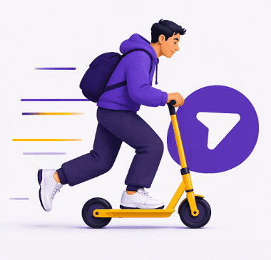

Direction
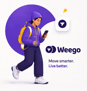
Illustration is the brand's strongest emotional differentiator. Flat, modern, editorial style — scenes of African urban life with stylised characters. Every illustration must include Purple Heart and Mikado Yellow (architecture rule, no exception).
Characters. Stylised silhouettes, slightly elongated proportions. Simple or featureless faces, for universality. Visible and non-stereotyped diversity (skin tones, outfits, ages, genders). Movement on every character.
Scenes. Bus stop, someone looking at the app, a group exiting a station, urban landscape with a Weego vehicle in the background.
Palette. Base Purple Heart + Mikado Yellow. Torch Red accents (1-2 elements max). Shadow Planet and Cloud neutrals. Skin: natural-tone spectrum.
Do
- Purple + Yellow in every illustration.
- Homogeneous, consistent style across materials.
- Real contexts of African cities — mix, density, movement.
- Vehicles that look like real vehicles (minibus, taxi, tram).
Don't
- Identifiable stock illustration (unDraw, Humaaans, Open Doodles).
- Mixing two styles on the same material.
- Exotic clichés (savanna, baobabs, masks).
- Ethnic caricature.
- Isometric 3D.
Production
- Ideal: a custom illustration library, commissioned from an African illustrator.
- Fallback: custom illustrations done in-house, with a strict style guide.
- Never: AI generation without retouching.
Chapter 10
Photography
Pan-African direction, per product

Weego
High saturation · warm colors · urban life

Weegolines
Medium saturation · neutrals · pro

WeegoPro
Low saturation · cool · credible
Cross-cutting principles
- Real, not staged. Prefer reportage to a planned session.
- Contemporary African urbanity, without exoticism or caricature.
- No identifiable stock photo. If stock, only banks oriented toward urban Africa (Nappy, TONL, CreateHER Stock).
- Movement is a theme. Subtle directional blur, moment capture.
- Natural light dominates. Golden hour, clear morning, late day.
- Real diversity: ages, outfits, genders, body types, styles.
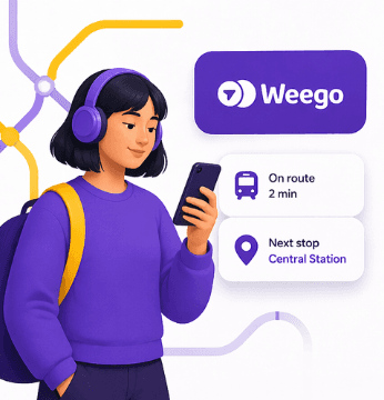
Weego (B2C passengers)
| Main subject | Passengers in action: boarding, waiting, checking phone, going through a turnstile, chatting at a stop |
| Setting | Streets, stations, active neighborhoods, dense urban life |
| Light | Clear day or golden hour, saturated |
| Framing | Tight to medium, human, eye-level |
| Treatment | Vivid color, strong contrast |
| Energy | Alive, warm, the pulsing city |
| Dominant format | 4:5 vertical (mobile first), 16:9 for site |
Weegolines (B2B companies)
| Main subject | Employees commuting, arriving at the office, shuttle atmosphere, organisational details |
| Setting | Business parks, peri-urban zones, shuttle interior, company lobbies |
| Light | Soft morning, late day, diffused natural light |
| Framing | Medium, steady, well-constructed frame |
| Treatment | More restrained color, lightly desaturated, medium contrast |
| Energy | Calm, pro, reassuring |
| Dominant format | 16:9 landscape |
WeegoPro (B2B operators)
| Main subject | Operators at work: drivers, supervisors, fleet managers, dispatch centers |
| Setting | Depots, garages, control rooms, ops office interior |
| Light | Natural mixed with pro interior lighting, neutral |
| Framing | Medium to wide, showing the craft |
| Treatment | Neutral color, crisp contrast |
| Energy | Credible, serious |
| Dominant format | 16:9 landscape, 1:1 for slides |
Human direction (casting)
- Real profiles before actors. If actors, avoid "too model" faces.
- No forced poses, no camera gaze with commercial smiles.
- Visible Pan-African diversity in corporate-image casting.
- Realistic attire: people dressed how they actually dress.
- Respect: never staging that caricatures trades.
Light direction by sub-brand
| Weego | Weegolines | WeegoPro | |
|---|---|---|---|
| Saturation | High | Medium | Low |
| Contrast | Strong | Medium | Crisp |
| Grain | Subtle OK | Zero | Zero |
| Dominant color | Warm | Neutral | Cool |
| Filters | None | None | None |
What we never show
Don't
- Savanna, baobabs, sunset on the horizon with a minibus (exotic-Africa cliché).
- Colorful markets in touristy-cliché format.
- Poor children, favelas, misery.
- White "experts" surrounding local "learners".
- Drones flying over neighborhoods like stock.
- Drivers smiling awkwardly at the camera.
- Blurred faux-techy dashboards.
- Empty buses with a futuristic effect.
Production and sourcing
- Ideal: a dedicated shoot per sub-brand, every 6 to 12 months, with an African photographer based in one of our cities.
- Fallback: alternative photo banks oriented toward urban Africa (Nappy, CreateHER Stock, TONL, Shutterstock African Voices curated).
- Never: full AI generation of synthetic images. Discreet AI retouching allowed.
Rights and distribution
- Written image rights release for each shoot.
- Broad licenses (web, print, multi-sub-brand, 5-year+ duration).
- Storage in a shared DAM (Digital Asset Manager).
Chapter 11
Design Elements
Patterns, color blocks, ornaments
Mark · tiled
The logo tiled in a grid · Purple tint + Purple
Arrow · halftone
The chevron in a tonal gradient · Cloud + Shadow
Arrow · perspective
Chevrons in a grid, diagonal depth · Shadow + Yellow
Mark · orbit
Concentric rings of the logo · Yellow + White
Single source
All Weego motifs, patterns and decorative elements derive from a single primitive shape: the two logo circles + the directional arrow. That's what unifies the visual language.
Weego pattern
A grid of circles and arrows, variable in density and color depending on context.
Three intensities.
- Dense pattern. Saturated backgrounds, packaging, envelope interior, deck cover. Tight circles + arrows, small scale.
- Airy pattern. Presentation sections, slide transitions, stationery. Spaced circles + arrows, large scale.
- Linear pattern. Headers, footers, decorative bands. Strict horizontal or vertical repetition.
Pattern color rules
| Context | Background | Pattern |
|---|---|---|
| Weego | Purple Heart or Shadow Planet | Mikado Yellow + Torch Red |
| Weegolines | Shadow Planet or Cloud | Purple Heart + Mikado Yellow amplified |
| WeegoPro | Cloud or White | Purple Heart + Mikado Yellow + Indigo Tech (fine strokes) |
| Corporate (group) | Shadow Planet or White | Purple Heart + Mikado Yellow only |
Reminder: Purple + Yellow required in every variant.
Color blocks
The main graphic construction form for layout. Usage: slides, posters, web sections, chapter covers.
- Full-color rectangular blocks, aligned to the grid.
- A block can hold a pattern overlay (15 to 30% opacity).
- Maximum 3 color blocks per layout.
- Yellow is always the luminous color, visual-hierarchy accent — never the main background of a large text surface.
Shapes derived from the logo
The Weego circle, reused as:
- Badge (photo placeholder, user avatar, product tag).
- Loading icon (rotation).
- Graphic punctuation (divider).
- Custom bullet point in deck lists.
The Weego arrow, reused as:
- Directional arrow (CTA, links).
- Motion marker (scroll indicator, pagination).
- Accent underline beneath a title (swoosh-type curve).
Textures
- No photographic texture (paper, grain, leaf).
- Only grain allowed: a light compression noise on some Weego photos.
Backgrounds
| Type | When | Rule |
|---|---|---|
| Solid Purple Heart | Hero, covers, events | Yellow or White as the main element |
| Solid Shadow Planet | Investor deck, technical cover, evening event | Yellow or White in contrast |
| Solid Yellow | Rare use, section accent, badge | Never large text surfaces on yellow |
| Cloud / Off-white | Default, 80% of B2B uses | Main scale-up background |
| Pattern | Transitions, secondary sections | See color rules |
Do
- Derive every graphic element from the logo language (circles + arrow).
- Respect the 3 pattern intensities.
- Always Purple + Yellow in every pattern and block combination.
- Use color blocks to structure the layout.
Don't
- Grunge textures, retro, coffee stains.
- Random imported shapes (Dribbble 2021 blobs).
- Pattern outside the circles+arrows matrix.
- Random pattern opacities. Fixed values: 100%, 50%, 30%, 15%.
- Flashy multi-color gradients outside the palette.
Chapter 12
Applications
Stationery, decks, social, merch, digital
Business Card
Corporate stationery
Letterhead
Corporate stationery
Deck cover
Presentations
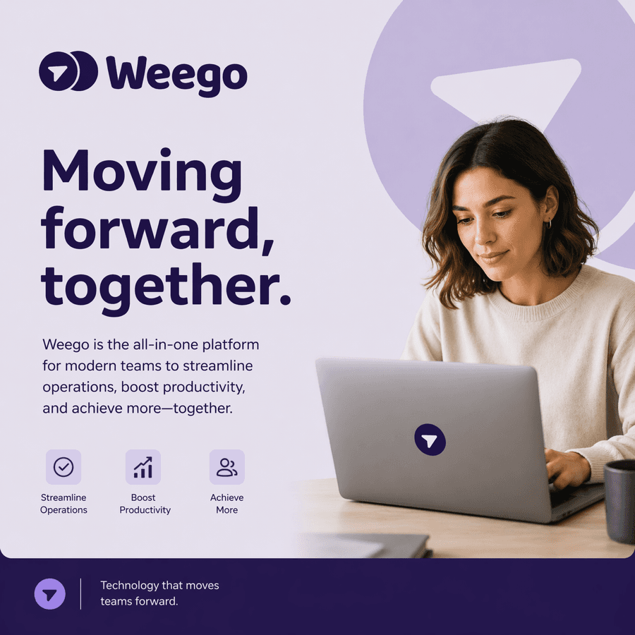
Social post
Social media
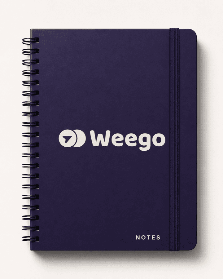
Notebook
Merchandising
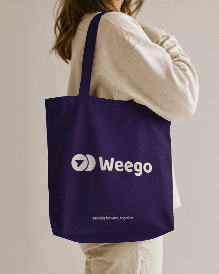
Tote bag
Merchandising
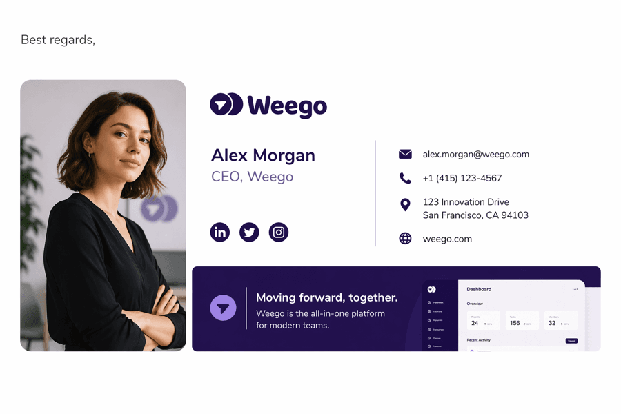
Email signature
Digital
Vehicle livery
Signage
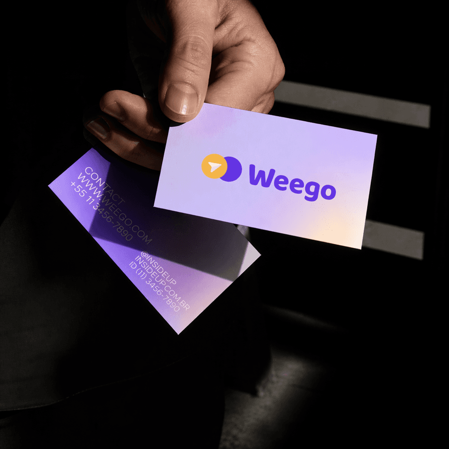
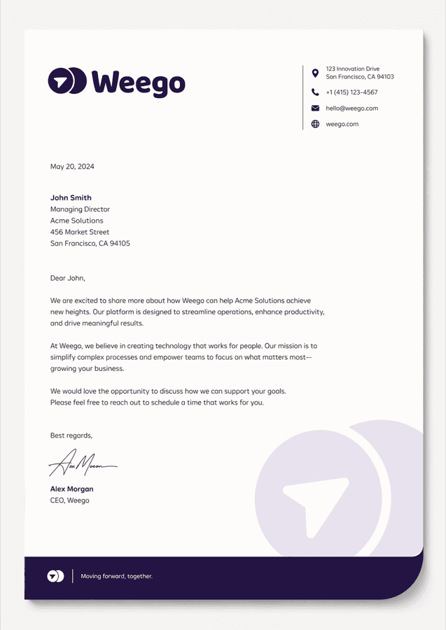
Corporate stationery (masterbrand)
Official company stationery uses the Weego masterbrand, not the sub-brands. It is product-neutral.
| Material | Spec |
|---|---|
| Letterhead A4 | Weego logo top-left, contact and address at the bottom, Cloud background, bottom signature band in Purple Heart + Mikado Yellow |
| DL envelope | Weego logo on the face, airy pattern on the back in Purple / Yellow, return address on the flap |
| Business Card (85×55mm) | Front: Weego logo + name + role in Poppins. Back: solid Purple Heart with yellow arrow OR Cloud with pattern |
| Email signature | Compact Weego logo + name + role + URL + phone. Color accent according to the product |
Commercial stationery (sub-brands)
When the material is specific to a sub-brand, it uses its logo, its color proportions, and its visual direction (illustration / photo).
- Weego: passenger flyer, urban poster, stickers, general-audience tote bag.
- Weegolines: commercial proposal, HR document, employee onboarding, shuttle signage.
- WeegoPro: technical document, B2B commercial proposal, API documentation, monthly report.
Deck templates
Four templates: one per sub-brand + one corporate.
Shared structure.
- Cover: large Poppins Extrabold + logo + color accent.
- Table of contents / Agenda: numbered list, Inter.
- Section divider: full-color block with number and title.
- Standard content: 2 columns text or text + visual, Inter body, Poppins eyebrows.
- Data slide: graph in the product palette (JetBrains Mono for WeegoPro).
- Quote / emphasis: large Poppins or Georgia italic on Purple or Shadow background.
- Closing / thanks: logo + URL + contact.
Formats. 16:9 (standard), 4:3 (legacy if needed).
Social media templates
| Format | Dimensions | Usage |
|---|---|---|
| Square post | 1080×1080 | LinkedIn, Instagram, Facebook feed |
| Vertical post | 1080×1350 | Instagram feed |
| Story / Reel | 1080×1920 | Instagram, TikTok, LinkedIn |
| Cover / Header | 1500×500 | LinkedIn, X |
Cross-cutting rules.
- Always the sub-brand logo (not the masterbrand, except corporate posts).
- One idea per post.
- Visible product color accent.
- Purple + Yellow present.
- Title in Poppins, body in Inter.
- Figma and Canva templates to be delivered with the guide.
Merchandising
| Product | Spec |
|---|---|
| Tote bag | Cloud or Purple Heart, centered Weego logo or airy all-over pattern. Weegolines and WeegoPro variants acceptable |
| Hoodie / T-shirt | Shadow Planet or Cloud. Small-format embroidered chest logo. Avoid huge prints |
| Notebook A5 | Purple Heart cover, inside pages with a discreet pattern in the header. Corporate or sub-brand version |
| Bottle / flask | Shadow Planet with laser Mikado Yellow logo |
| Badges / stickers | Logo circle + arrow versions in various colors |
Digital applications
- weegolife.com: masterbrand, leads to the 3 product pages.
- Product sites (if distinct): respect sub-brand direction.
- Weego app: respects the iconography, color system and typography chapters. The UI is its own design system inheriting the brand rules.
- Transactional email: sober template, logo of the relevant sub-brand.
- WeegoPro dashboard: dominant neutrals, Purple + Yellow highlights, Indigo Tech for data-viz.
Physical signage
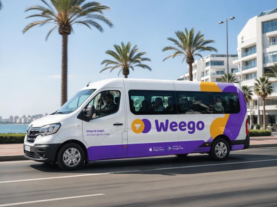
- Vehicles (buses, shuttles): dominant Purple Heart, clearly visible logo, accent per product.
- Weego stops: Shadow Planet with Mikado Yellow logo, airy pattern.
- Internal office: consistent editorial mix with photo and illustration.
Do
- Always start from an approved template.
- Respect color proportions per sub-brand.
- Check that Purple + Yellow are present on every material.
- Use the typographic stack strictly.
Don't
- Create a new material without validating the template with the brand team.
- Mix sub-brands on the same material (except group presentation).
- Modify the logo to fit a context better.
Chapter 13
Resources
Source files, contact, version
Logo pack
DriveSVG, PNG, dark & light. 3 sub-brands + masterbrand
Founder photos
DriveHi-res headshots 300dpi
Boilerplate
DocCompany description & bios
Source files
All brand files are centralised. The DAM (Digital Asset Manager) contains:
- Logos (SVG, PNG, EPS) for the 3 sub-brands + masterbrand. Available now ↑
- Color palette (Adobe ASE, Figma tokens, CSS variables).
- Typographic stack (.woff2, .ttf files).
- Icon library (Phosphor base + custom transport icons).
- Illustration library.
- Photo library. Founder photos available ↑
- Deck templates (Figma, Google Slides, Keynote).
- Social templates (Figma, Canva).
- Stationery templates (InDesign, Figma).
Who to contact
Any question, file request, campaign validation or rule exception goes through the Weego brand team. brand@weegolife.com
Version
Version 2.0
April 2026
Weego Mobility Lab Sarl
Casablanca, Morocco
weegolife.com
A brand question?
The brand team decides on every exception.
Weego Brand System · v2.0 · April 2026